The people who use business software are experts. They know batteries, invoices, patients, stock or contracts far better than the people who build their tools. What they usually are not is experts in software, and they should not have to become one to do their job.
When the system behind a screen is complicated, the design’s job is to carry that complexity so the person using it does not have to. Two of our own products show it well. Underneath the E-Bike Battery Passport is a regulated data model with versions, permissions and a full history for every battery; in front of it are workshop staff, dealers and people buying a second-hand e-bike. Underneath Marnu, our accounting app, are double-entry books an accountant would sign off; in front of it is a small business owner who wants to know what they can spend. Here is what designing for them has taught us.
Use their words, not the system’s
Every system grows its own vocabulary: entities, records, statuses, the names of tables and processes. It is tempting to put those words on the screen, because they are precise and they already exist. They are also meaningless to anyone outside the team.
The words on the screen should be the ones people already use at work. For the battery passport’s Dutch screens, we fixed a glossary before translating anything. In ordinary sentences the product is an “accu”, the word a workshop uses. The formal “batterij” appears only where a label names something the regulation itself defines, and there it uses the regulation’s exact term.
Say what you know, and how you know it
Complex systems hold information of very different quality. Some of it was confirmed by a manufacturer, some typed in by an owner, some calculated, some simply missing. Showing all of it in the same way asks people to trust everything equally, which they rightly will not.
So where information comes from is part of the information. The design brief for our product asked for labels in words, such as “Manufacturer verified”, “Owner supplied” and “Verification pending”, rather than a row of coloured ticks. A public passport says plainly when a company has not yet been verified by the platform. A buyer does not need to understand how verification works to understand the difference.
Missing is not zero
One rule matters more than it looks: a value that is missing is shown as unavailable, never as zero. A battery health of 0% is a measurement, and an alarming one. A health that nobody has measured yet is something else entirely. Collapsing the two into the same number looks tidy and tells people something false. Where our product has nothing to show, it says “Information unavailable”.
Show each person what they came for
A complex product usually serves several kinds of people, and each of them needs a different slice of it. A buyer checking a second-hand battery wants to know whether it is what the seller claims, and whether it has been reported stolen. A workshop wants its repair history and state of health. A compliance manager wants to see which records are incomplete.
Putting everything on one screen for everyone serves none of them. In the battery passport, public and restricted information are kept apart by design: the page a QR code opens shows what a buyer may see, and the detail professionals need sits behind their own sign-in. The result is not less information. It is the right information in front of each person, with nothing to wade through first.
Never rely on colour alone
Green for good and red for bad is the first thing most dashboards reach for. It fails for people with colour vision deficiencies, on a bright screen outdoors, on a grey printout, and whenever the meaning is more subtle than good and bad.
Every status in our product carries a text label, and colour only reinforces it. The rule costs almost nothing to follow and prevents a whole category of misunderstanding.
Make the next step obvious
People who do not live in software rarely explore. They look for the thing they came to do, and if it is not obvious, they stop, or they call someone. A few principles help:
- One main action per screen. If everything is emphasized, nothing is.
- Name buttons after what they do. “Record repair” rather than “Save”, “Transfer ownership” rather than “Continue”.
- Confirm what happened. After an action, say what changed, in a sentence, where the person is already looking.
- Make mistakes recoverable. Where something cannot be undone, say so before it happens, not after.
Write errors that help
An error message is often the only moment the software speaks to someone directly, and it usually arrives when they are already frustrated. “Something went wrong” tells them nothing they did not know.
A useful error says three things: what happened, in plain words; whether anything was lost; and what to do next. It keeps whatever the person typed. It never blames them for a mistake the system could have prevented, such as a date in the “wrong” format. And if the answer is to try again later, it says how much later.
Be honest about uncertainty
Software often knows less than it appears to. Information may be cached and out of date, a connection may have dropped, a change may still be waiting to sync. Technical users read these situations from small clues. Everyone else takes the screen at face value.
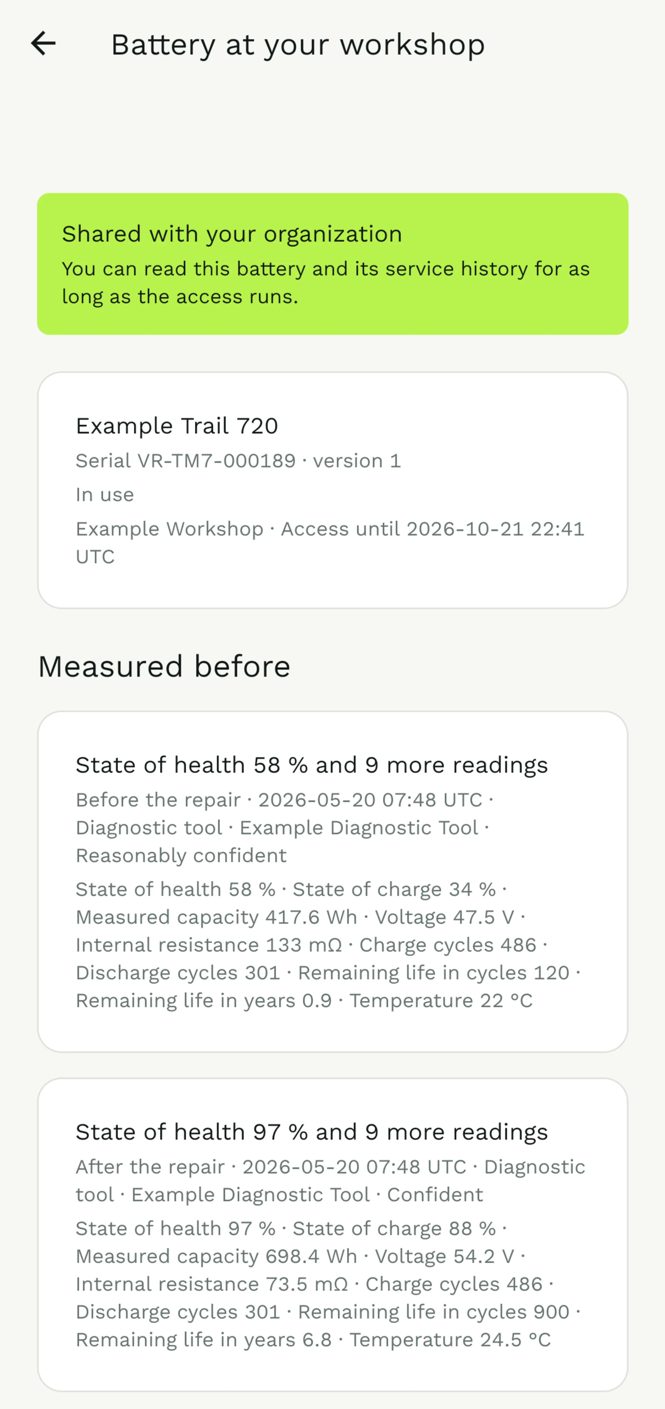
The battery passport’s mobile app is meant for workshops, where the connection is not always good. The principle we designed it around is simple: when information comes from the phone’s own copy, the screen says so, and says when that copy was last updated. People can make good decisions with old information, as long as they know it is old.
Marnu applies the same honesty to estimates. Its “safe to spend” figure takes the bank balance and subtracts the VAT, the income tax to set aside, the bills coming up and a buffer. Every figure shows that breakdown and says it is an estimate, and a negative result is shown as negative, never rounded up to zero. A completeness score rounds down, so one missing receipt in a thousand reads 99%, not a reassuring 100%.
Test with the people, not the team
Everyone who builds a product knows it too well to see it clearly. The only reliable test is to watch the people it is for use it, with their own tasks, on their own devices, without help. The moments where they hesitate are the design’s real to-do list.
It does not take a research budget. A handful of sessions with the right people will surface most of the problems that matter, and the first two or three usually find the same ones. What it does take is the discipline to watch without helping, and to treat every hesitation as the product’s fault rather than the person’s.
Clarity is not the same as simplicity. The system can be as complex as the problem needs, as long as each screen asks people to understand only what they came for.
Designing for people who are not technical is not about hiding things, and never about talking down. It is about respect: for their expertise, for their time, and for their right to understand what the software is telling them.